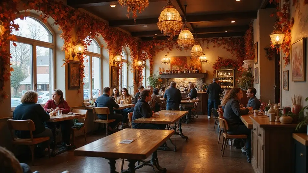
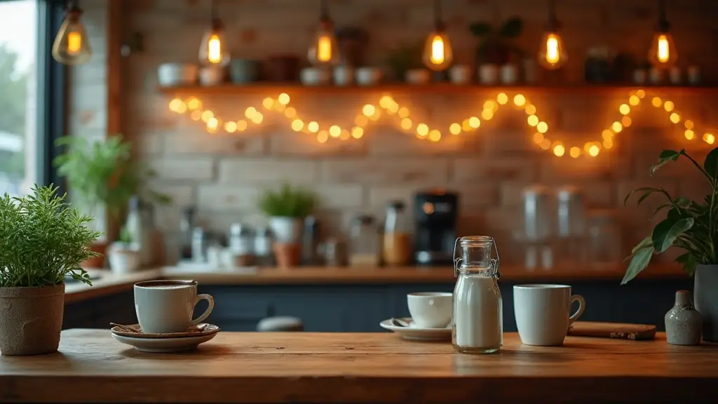
As the leaves turn and a crispness fills the air, there’s no better time to infuse your café with the warm and inviting hues of autumn. This season calls for a cozy atmosphere, where customers feel embraced by the comfort of earthy tones and vibrant shades alike.
With the right autumn color palettes, your café can become a haven for those seeking a delicious pumpkin spice latte or a warm pastry, all while surrounded by an ambiance that reflects the beautiful changes outside. Get ready to explore 15 unique autumn color schemes that not only enhance aesthetics but also create a welcoming vibe perfect for enjoying a fall afternoon with friends or a peaceful moment alone.
Whether you prefer deep oranges and browns or soft, muted yellows and greens, these palettes will inspire you to reimagine your café space this fall.
Contents
- 1. Rustic Earth Tones
- 2. Warm Neutrals
- 3. Bold Burgundy
- 4. Harvest Gold
- 5. Deep Teal
- 6. Pumpkin Spice Palette
- 7. Muted Greens
- 8. Cinnamon Brown
- 9. Charcoal Gray
- 10. Soft Plum
- 11. Sage and Terracotta
- 12. Creamy Whites and Accents of Honey
- 13. Mustard Yellow
- 14. Vintage Autumn
- 15. Soft Blush and Earthy Tones
1. Rustic Earth Tones

Nothing screams autumn quite like rustic earth tones. Think deep browns, burnt oranges, and muted greens. These colors mimic the natural world, making patrons feel grounded and connected to the season.
Using reclaimed wood tables paired with olive green chairs can evoke a sense of warmth and authenticity. Accent walls painted in deep terracotta or warm beige can create focal points in your café space. Don’t forget to incorporate plants like succulents or ferns in earthy pots to add a dash of nature.
A cozy atmosphere is essential during fall, and earth tones do the trick effortlessly. Incorporating these colors can spark conversation among customers, making your café a lively locale.
– Tips: Use natural materials in furniture and decor.
– Insights: Mixing textures enhances the cozy feel.
– Suggestion: Add vintage touches with decor pieces to amplify the rustic vibe.
Embrace the essence of autumn with rustic earth tones! Deep browns, burnt oranges, and muted greens connect your café to nature, creating a cozy retreat where every sip feels like a warm hug.
2. Warm Neutrals

Warm neutrals are the perfect backdrop for an inviting café. Shades of beige, cream, and soft taupe create a serene environment where customers can relax.
These colors work beautifully with wooden accents, creating a canvas that allows seasonal decorations to pop. Imagine a wall painted in a soft taupe paired with creamy furniture, then adding cozy throw pillows in burnt sienna or mustard for a touch of color.
The beauty of warm neutrals is their versatility. You can easily switch up decorations while keeping the same base palette. Seasonal flowers in rich colors can add vibrancy without clashing with the warm tones.
– Tips: Use layered lighting to enhance the warmth.
– Insights: Neutrals can help make a small space feel larger and more open.
– Suggestion: Consider using textured fabrics for cushions and curtains to add depth.
3. Bold Burgundy

Burgundy is a bold choice for autumn that brings warmth and sophistication. This rich red hue can be used on walls or as accent furniture, offering a luxurious touch to your café.
Pair burgundy with gold accents, like brass fixtures or golden tableware, to elevate the ambiance. Think of deep burgundy chairs around wooden tables, with soft golden lighting illuminating the space. This color scheme creates an intimate setting, perfect for cozy gatherings.
Burgundy also resonates with the flavors of fall, evoking images of mulled wine and spiced pastries. Accentuating your café with this color can set the mood for those seeking a more upscale experience.
– Tips: Use burgundy as an accent rather than the main color to avoid overwhelming the space.
– Insights: It pairs beautifully with navy or dark green for a modern twist.
– Suggestion: Incorporate burgundy in your table settings for a refined touch.
Embrace bold burgundy this autumn! Pair it with golden accents for a luxurious vibe that invites cozy gatherings and warm conversations in your café retreat.
4. Harvest Gold

Harvest gold is reminiscent of autumn leaves and the warmth of a bonfire. This color brings a cheerful vibe to your café, making it feel inviting.
Incorporate harvest gold through wall paint, upholstery, or decorative elements. Pair it with soft browns and creams for a balanced look that feels both vibrant and grounded. A harvest gold feature wall can become a great backdrop for photos, allowing customers to share their experiences.
Adding harvest gold accessories, like vases or art pieces, can help tie the whole look together. This color scheme pairs beautifully with your fall menu, enhancing the overall seasonal experience.
– Tips: Combine with natural wood elements to enhance warmth.
– Insights: Harvest gold can create a nostalgic feel, reminiscent of childhood autumns.
– Suggestion: Use seasonal fruits in harvest gold tones as decor for a fresh touch.
5. Deep Teal

Deep teal is an unexpected yet stunning choice for autumn. This sophisticated color adds depth and a modern twist to traditional autumn palettes.
Incorporate deep teal through painted walls or bold furniture choices. It pairs beautifully with warm earth tones, creating a cozy yet contemporary feel. Picture deep teal chairs around rustic wooden tables, creating a striking contrast.
Adding plants can enhance this palette, with greenery popping against the darker shades. This color invites conversation and can be a perfect backdrop for your café’s unique personality.
– Tips: Use deep teal sparingly as an accent to avoid making the space feel too dark.
– Insights: This color works well with metallic accents, like copper or brass.
– Suggestion: Consider teal artwork that reflects the season, adding visual interest to the walls.
6. Pumpkin Spice Palette

Inspired by the beloved fall beverage, a pumpkin spice palette combines warm oranges, creamy whites, and hints of cinnamon brown. This palette encapsulates the essence of autumn and invites customers to indulge in seasonal delights.
Use a pumpkin spice palette in your café by painting accent walls in soft orange and pairing them with creamy white furniture. Incorporate rich brown accents in cushions or table settings, echoing the flavors of fall.
This color scheme not only looks appealing but also creates a sensory experience, as the colors resonate with the scents and tastes of autumn. It’s an inviting choice for those looking to cozy up with a warm drink.
– Tips: Incorporate seasonal decorations such as pumpkins and gourds.
– Insights: This palette is perfect for creating a cheerful, vibrant atmosphere.
– Suggestion: Utilize warm lighting to enhance the inviting feel of this color scheme.
Warm oranges and creamy whites create a cozy retreat – just like your favorite pumpkin spice latte! Embrace the season with an autumn color palette that invites indulgence and comfort.
7. Muted Greens

Muted greens bring tranquility to your café, providing a sense of peace that complements the falling leaves outside. Shades like sage or moss create a calm, inviting atmosphere.
Incorporate these colors through wall paint or upholstery to create a soothing environment. Pairing muted greens with white or light wood can lighten the space and make it feel airy. Adding green plants will enhance this feeling, connecting your customers with nature.
Muted greens also blend well with other autumn colors, making them versatile. They provide a perfect backdrop for seasonal decorations and centerpieces in warm colors.
– Tips: Use layered textures to add warmth.
– Insights: This soothing color can help create a relaxed vibe, ideal for customers looking to unwind.
– Suggestion: Consider using muted green tableware for a cohesive look.
You might also like


8. Cinnamon Brown

Cinnamon brown is a warm, cozy color reminiscent of spice markets. This hue can add a delightful warmth to your café that feels inviting on chilly autumn days.
Use cinnamon brown for your flooring or furniture to create a rich, welcoming foundation. Pair it with cream and copper accents to create a sophisticated and inviting setting. Consider softening the space with plush cushions in light neutral shades, allowing the cinnamon brown to stand out.
This rich color also resonates with the seasonal flavors served in your café, creating a cohesive experience from the décor to the menu.
– Tips: Balance darker shades with lighter elements to avoid making the space feel heavy.
– Insights: Cinnamon brown pairs well with other warm tones for a rich palette.
– Suggestion: Use cinnamon-scented candles to enhance the cozy feel.
9. Charcoal Gray

Charcoal gray is a contemporary and chic choice that provides a modern twist to traditional autumn color schemes. This deep, moody color can be paired with bright autumnal hues to create a captivating contrast.
Consider using charcoal gray on walls or major furniture pieces, then brighten the space with yellow or orange decor elements. Throw pillows or artwork in cheerful autumn shades can pop beautifully against the dark gray backdrop, making the space feel more dynamic.
The elegance of charcoal gray can elevate the overall sophistication of your café, attracting customers looking for a modern and cozy atmosphere.
– Tips: Use charcoal in smaller doses to avoid overwhelming the space.
– Insights: This color pairs well with metallic accents for a trendy feel.
– Suggestion: Use lighting strategically to enhance the gray tones.
10. Soft Plum

Soft plum is a unique and dreamy color choice for fall, adding a touch of elegance and warmth to your café. This soft purple shade can create a cozy and intimate environment for customers.
Incorporate soft plum through wall accents or decorative features like cushions or artwork. Pairing it with warm neutral colors can create balance and make the plum pop without overwhelming the space. Soft lighting can enhance the richness of this color, adding to the cozy atmosphere.
Soft plum is perfect for seasonal events or special promotions, as it offers a sophisticated look that stands out.
– Tips: Use this color in textiles or small decor items for a subtle effect.
– Insights: Plum pairs beautifully with gold accents for a luxurious feel.
– Suggestion: Consider hosting themed evenings with plum-inspired menu items to match the decor.
Embrace the elegance of soft plum this autumn! A dash of this dreamy color paired with warm neutrals can transform your café into a cozy retreat that invites customers to linger and savor every moment.
11. Sage and Terracotta

The combination of sage green and terracotta is a refreshing take on autumn colors. This earthy duo provides a rustic yet chic vibe, blending well with natural materials.
Use sage green for your walls or furniture, and accent it with terracotta in decor or pottery. This combination creates a harmonious balance that feels inviting and comforting. Adding wooden elements enhances the rustic feel, making your café a retreat for guests.
The combination is not only visually appealing but also evokes the natural beauty of autumn, making it perfect for your café’s ambiance.
– Tips: Mix in textiles with both colors for added warmth.
– Insights: This palette is great for creating a nostalgic feel, reminiscent of autumn walks.
– Suggestion: Use terracotta pots for plants to echo the color scheme.
12. Creamy Whites and Accents of Honey

Using creamy whites alongside honey accents creates an airy and light atmosphere that feels fresh yet cozy. This palette is perfect for those wanting a modern and clean look that still embraces autumn.
Incorporate creamy whites through your walls or furniture, then add honey-toned decor to warm up the space. Soft lighting can create an inviting glow, making your café feel cozy, even in brighter hues. Cushions in honey or amber tones can bring the whole look together.
This color combination allows for seasonal decorating flexibility, making it easy to switch up decor throughout autumn.
– Tips: Use layering techniques with textiles to add warmth.
– Insights: This palette resonates with the simplicity of autumn, focusing on light and warmth.
– Suggestion: Use honey-inspired art or decor items to tie the theme together.
You Might Also Like


13. Mustard Yellow

Mustard yellow is a bold and cheerful color that adds a lively spark to your café. This color can energize the space while still feeling cozy, perfect for a busy autumn environment.
Use mustard yellow in accents, such as chairs or decorative pieces, to create a vibrant focal point. Pair it with deep greens or browns for a balanced look that feels warm and inviting. Mustard yellow can enhance your café’s seasonal menu, connecting customers with the flavors of fall.
The lively tone can lift spirits and encourage a lively atmosphere, making it perfect for community gatherings.
– Tips: Balance with neutral tones to keep it from overwhelming.
– Insights: Mustard yellow can pair beautifully with earthy elements, enhancing its warmth.
– Suggestion: Consider seasonal specials that reflect the color theme in food presentation.
14. Vintage Autumn

A vintage autumn palette combines muted oranges, soft greens, and deep browns, evoking nostalgia for autumns of the past. This color scheme welcomes customers into a cozy, timeless café that feels familiar and comforting.
Incorporate vintage-inspired furniture and decor alongside these colors. Think distressed wooden tables or retro-style chairs that reflect the warmth of the season. Accents in muted orange can tie together the vintage vibe, making the space feel welcoming and nostalgic.
This palette can resonate with customers looking for comfort and familiarity, making your café a preferred gathering spot during the fall.
– Tips: Use vintage decor elements for added charm.
– Insights: Nostalgic colors can encourage storytelling and connection among customers.
– Suggestion: Host vintage-themed events to enhance the cozy atmosphere.
15. Soft Blush and Earthy Tones

The combination of soft blush and earthy tones creates a gentle and inviting atmosphere perfect for autumn. This palette is unique and brings a fresh take on seasonal colors, making your café stand out.
Incorporate soft blush through wall colors or decorative elements like cushions. Pair it with earthy tones like taupe or deep green to create a harmonious balance. This combination not only feels fresh but also feels inviting and cozy.
Soft blush can create a lovely backdrop for your autumn menu while encouraging a calm yet inviting atmosphere.
– Tips: Balance soft colors with bolder accents for visual interest.
– Insights: This color palette resonates with those looking for a unique café experience.
– Suggestion: Use blush-themed desserts or drinks to enhance the overall aesthetic.
Conclusion

These autumn color palettes offer a beautiful way to transform your café into a cozy retreat for the season. Whether you prefer warm earth tones or bold hues, there is a perfect scheme to match your vision.
Consider how each palette resonates with your café’s personality and the experiences you want to create. Embrace the change of season and let these colors inspire a welcoming environment that draws in customers looking for that autumn vibe.
Related Topics
autumn color palette
cozy café design
earth tones
warm neutrals
rustic style
seasonal decor
interior design trends
vintage autumn
pumpkin spice theme
modern autumn colors
easy transformations
café atmosphere
Leave a Reply